Lelle Case Study
An all-in-one mobile app that tracks your wellness and nutrition products
Project Background
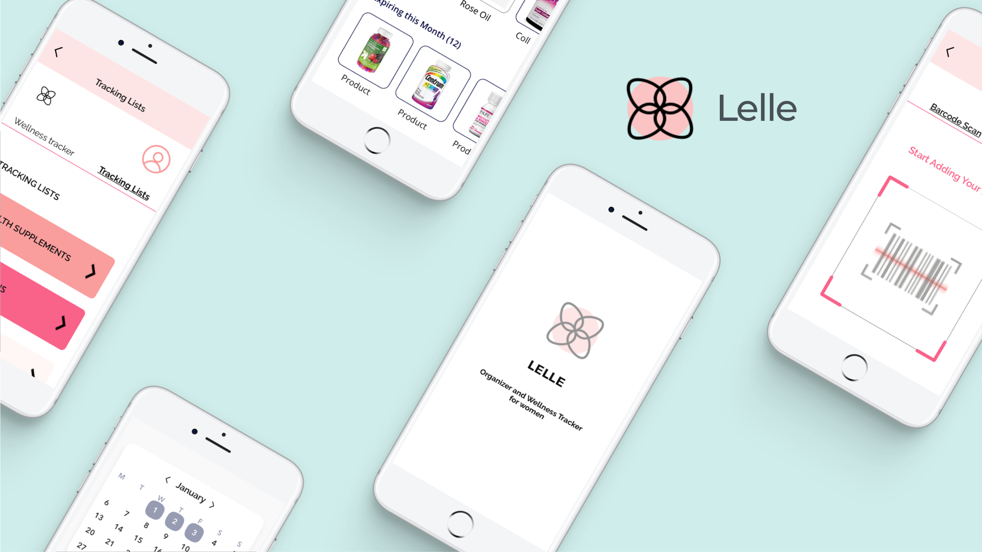
Lelle is an app for nutrition lovers to manage their inventory, and to keep track of their purchases, products to buy, and also their favorite items. This app also helps users track their wellness including meals, water intake, exercise and sleep as well as their vitamins and supplement consumptions.
Lelle Company hopes to create more awareness for nutrition since there are many women who are lacking knowledge about health and eating food that provide little nutritional benefits. Prevention is key when it comes to long sustainable health. If Lelle can help more people start eating healthier and taking their vitamins and supplements daily, then there will be less visits to the doctor and less chronic diseases in the world today.
Why We Should Care?
Lelle realized that many women are using vitamins, supplements, and other health products but doesn't have the time or resources to manage their daily wellness goals and nutrition products. In addition, many of us lose the enthusiasm needed to complete our health goals before we cross the finish line.
Our Solution
A new mobile app that reflects modern aesthetics and includes a personal organizer and a tool for wellness tracking.
Market Research Demographics
- As many as 50% of the US population takes multi vitamin daily and up to 30% take a supplement or mineral.
- CRN’s 2019 survey found that vitamins & minerals continue to be the most commonly consumed supplement category.
- The second most popular category is specialty supplements (40 percent), followed by herbals and botanicals (39 percent).
Demographics
Who Takes Dietary Supplements? 77 percent of U.S. adults take dietary supplements.
- 79 percent of female adults
- 74 percent of male adults
- 70 percent of adults 18-34
- 81 percent of adults 35-54
- 79 percent of adults 55+
With this information, a tracking tool can be highly beneficial for users who are consuming variety of products such as vitamins & minerals, sport and weight management supplements, herbals and botanicals.
Project Details
Client: Lelle
Role: UX/UI Designer
Team: Solo, with mentor guidance
Deliverables: Mobile design
Duration: 4 weeks
Tools: Illustrator, Photoshop, Zeplin, Invision, Sketch, CSS, HTML
Objectives
- Examine competitor’s strengths and weaknesses to learn how to differentiate Lelle Mobile App from other nutrition tracking or wellness apps.
- Conduct UX research to determine design decisions by secondary research
- To uncover frustrations, motivations, needs, and goals of users
- To identify how people keep track of their vitamins and supplements
- To identify the target market and potential users
Process
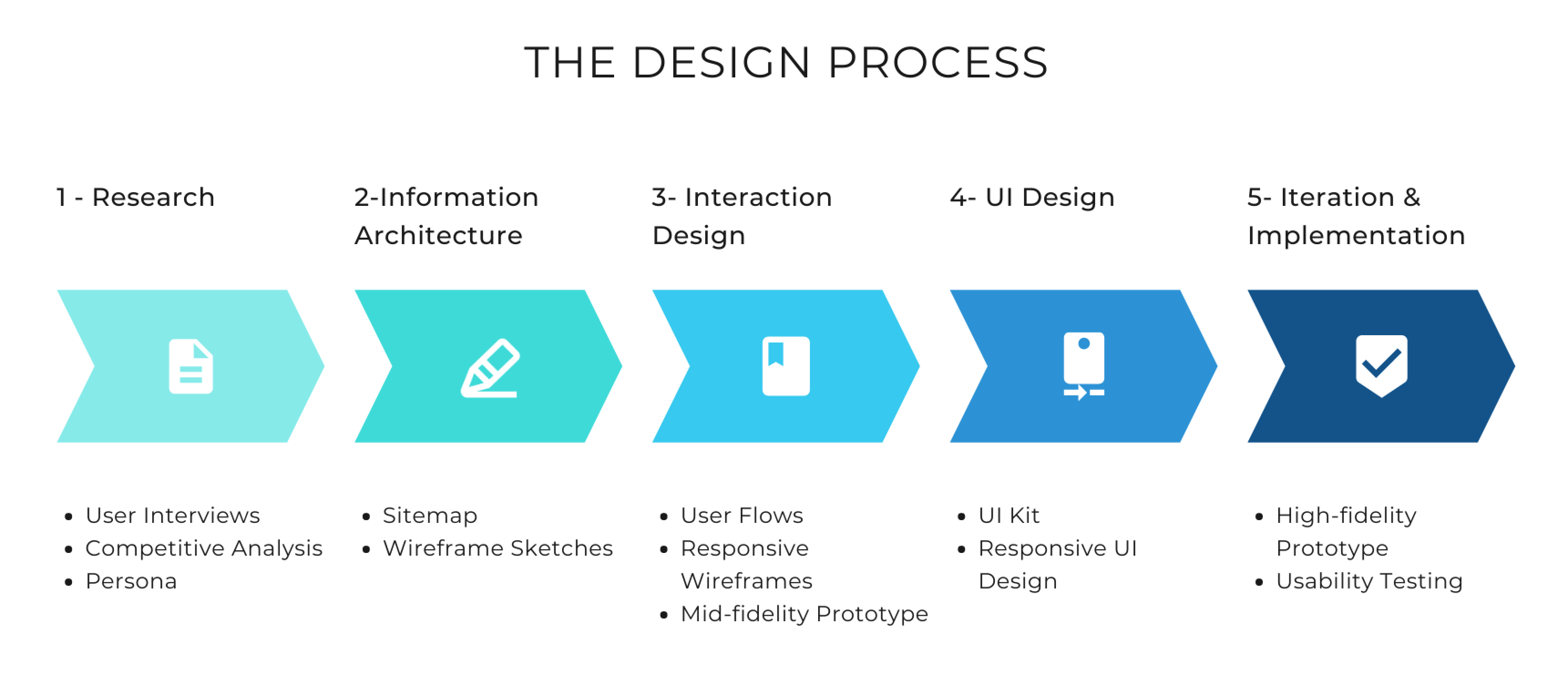
I followed a Design Thinking approach based on an iterative process to explore possible pain points and problems for users of health tracking apps like Lelle.
1. Research
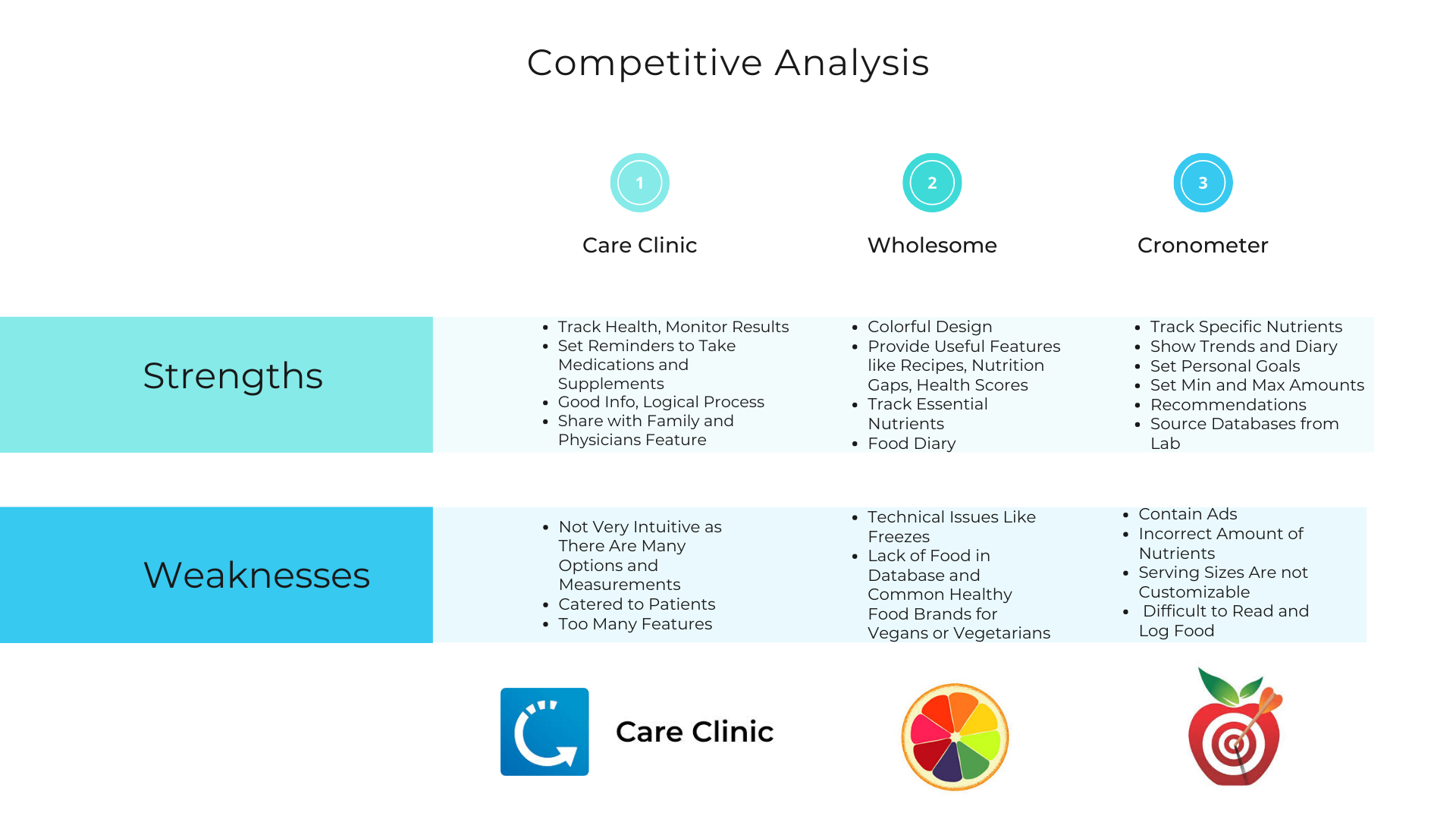
Competitive Analysis of Different Health Trackers
There aren't many health inventory apps in the market today as of March 2020. I discovered a few nutrition tracker apps but at this point I couldn't find many competitors that can track vitamin or supplement products as well as wellness.
In order to stand out from its competitors, the app will need strong branding and better tracking features with notifications. It’s essential to feature good usability and less requirements. This app will also need various UI/ UX features including tracking tools, nutrition info, analytics, trends and recommendations. Diversity is key. Our app should cater to any demographics including non-patients or non-nutrition enthusiasts. Lastly, we need a large data collection with hundreds of brands and products to be more inclusive.
"Accuracy and consistency with a simple and fun tracker goes a long way"
Project Goals
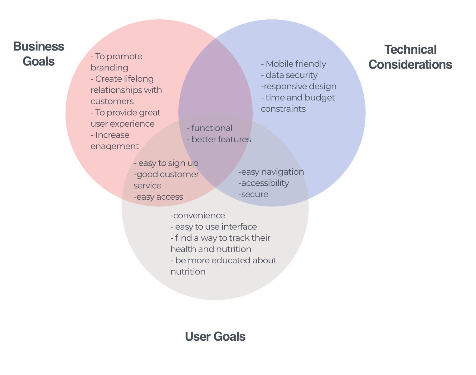
I created this diagram to observe the differences and similarities in respect to the Business, Tech and User needs. For business considerations, Lelle mainly aims to increase engagement which requires the tech team to help them create an app with fully functioning and intuitive features. Technical and user considerations are quite similar in terms of convenience, easy navigation, accessibility, and security. All sides need to work together as a whole in order to accomplish all goals.
Provisional Persona
Based on the secondary research, I created 2 provisional personas to define who the potential users are. These personas provided me with an idea on who I should approach and interview when I move towards my in-person interviews.
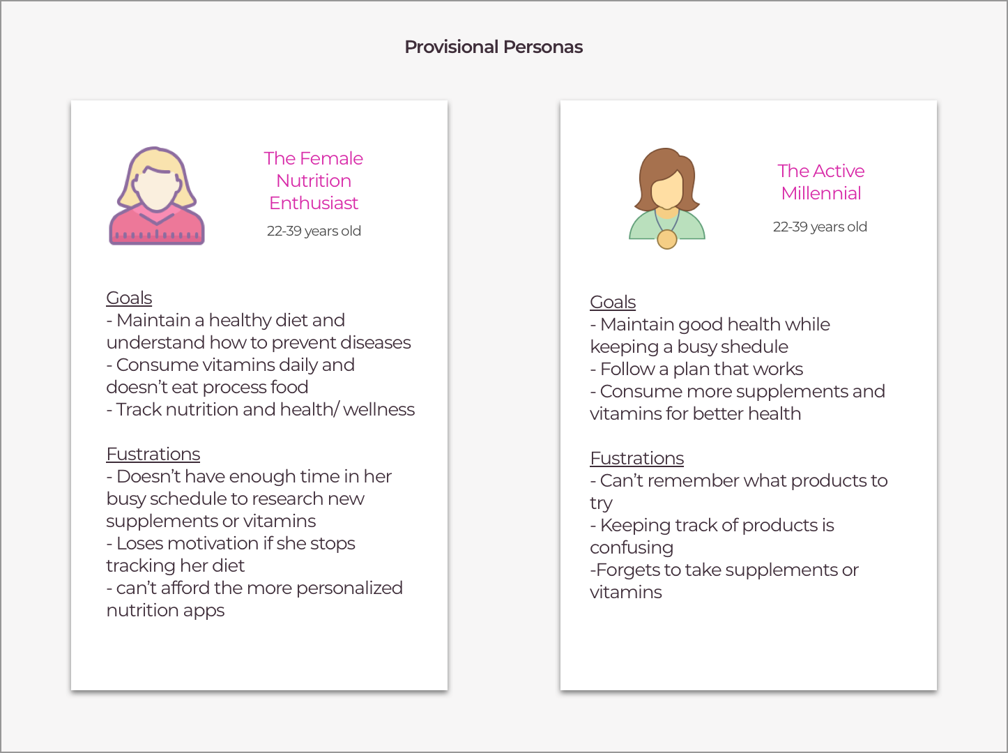
"These personas depict different types of users with their goals and frustrations. Are you one of these users?"
User Interviews
I started the project with research to understand more about trends in wellness and health tracking and to uncover the nutritional goals of our targeted users.
- For each participant, I asked open ended questions in order to understand more about the user’s needs and pain points. Some research questions include how do users organize their current products and how do they monitor their daily health. This information can help us understand deeper about the design and features that are beneficial for the user.
- For my user interviews, I found 3 participants both female and male who were between the ages 20-40 that are currently using vitamins, supplements, or other health products.
Needs by the users
- To be informed about their products
- To monitor their health on a daily basis
- To keep track of their daily trends
- To organize their everyday products
- To avoid over or under-consumption of certain supplements or products
Summary of Research Findings
- Some participants take over 10 products, such as vitamins, supplements, medications and health products and they take these products daily.
- Most don’t track their vitamins or medications intake or use any nutrition apps or tracker.
- Most don’t organize their products and sometimes forget their purchases resulting in many expired and wasted products.
- Most people care about their health, but doesn’t have the time to track or monitor their healthy lifestyle and end up giving up
User Persona
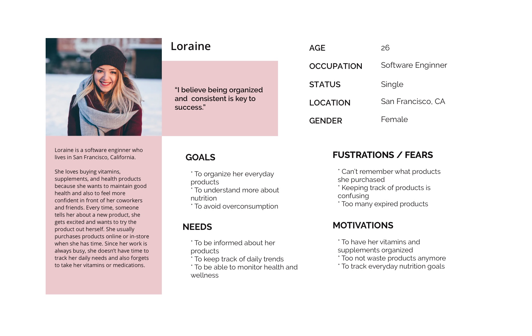
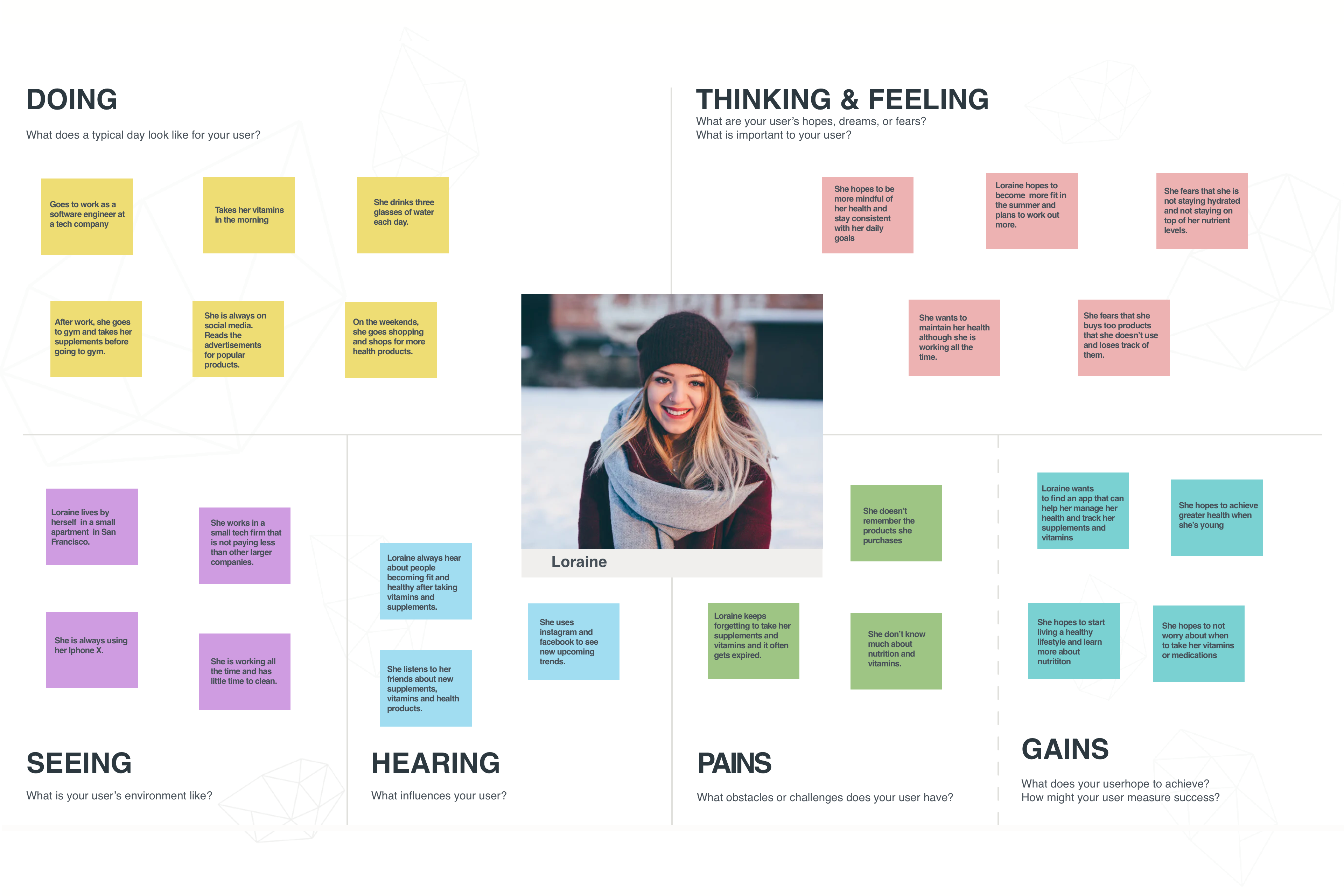
After the interviews and the secondary research findings, I felt like I had a better understanding of Lelle's target demographic and created a persona of someone I thought would be a potential customer. I wanted to create a persona that included characteristics of my interviewees but was also fictional. Loraine is our ideal user so her goals, needs, frustrations, and motivations were always kept in mind while making design decisions.
Empathy Map
I started to look for patterns to identify the user needs and to identify who the end users are. I organized into 6 groups by grouping similar responses and delivered with valuable insights. Based on the insights, I can conclude that the three main trends among the users are forgetfulness, overspending and hopes for sustainable long term health.
"Loraine hopes to not worry about when to take her vitamins or medications."
2. Information Architecture
Site Map
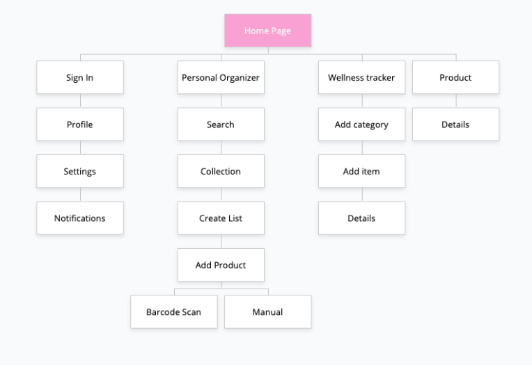
Next, I created a sitemap that would be helpful to illustrate the information architecture by showing the features, the main screens, and the child screens. The sitemap helps us to also understand how screens are connected to each other. Using the site map, I can organize all my content of the app and use it towards wireframing.
"Defining the structure"
3. Interaction Design
User Flows
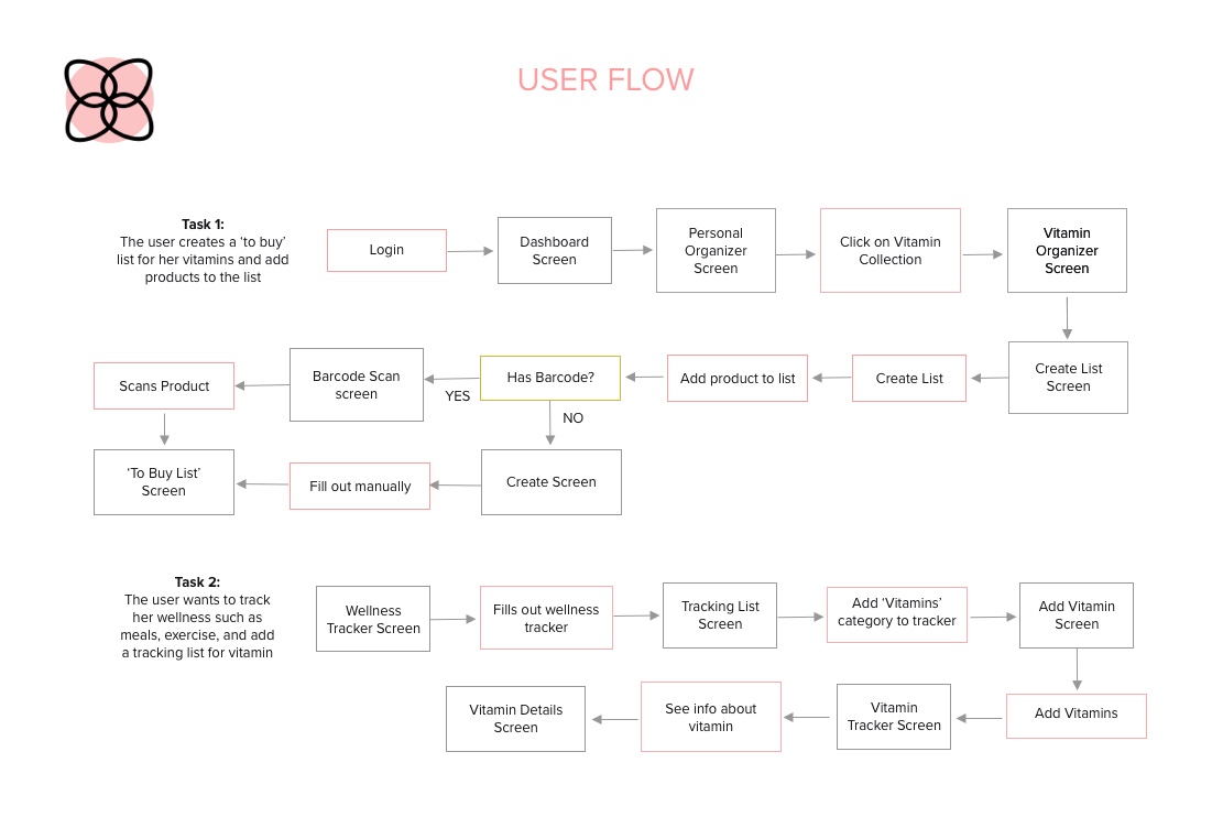
Then, I created a user flow to illustrate different pathways that a user can take to navigate through the app to complete a task. This helps me to understand which screens are needed in order for the user to have a good user experience. It should flow smoothly as users move from one screen to next and it should make sense to the user. Using this diagram, I was able to focus on the paths, and remember to stay on track with the user goals.
Mid-Fidelity Prototype
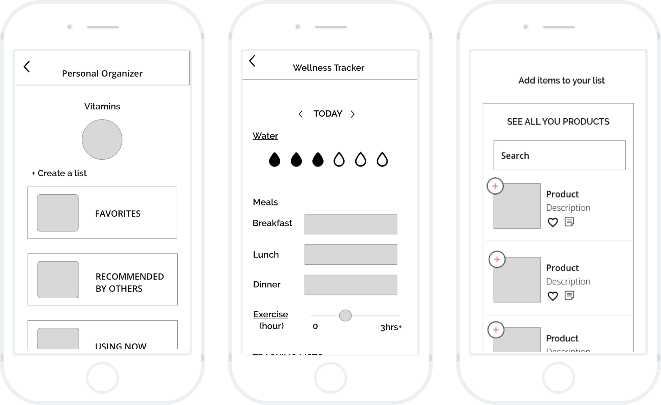
I created wireframe pages including login, dashboard, add products, personal organizer, and wellness tracker. Then, I connected the pages using InVision to create an interactive prototype. The purpose of the wireframe was to ensure that the branding was clear and contain all the features that the user needs.
"This is the beginning of creating the wireframes for the Lelle Mobile app."
4. UI Design
UI Kit
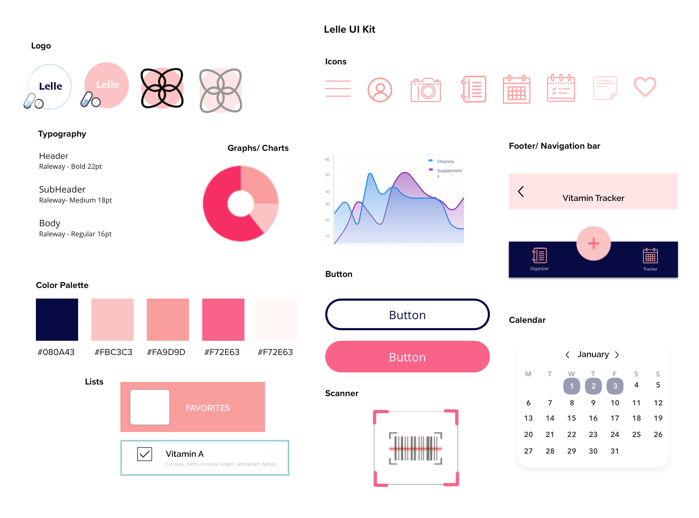
I decided to create a bright and inviting feel for Lelle, considering the styles Lelle's users would appeal to. Then, I created an UI kit that reflected Lelle's new identity and chose a welcoming color palette that fits the female audience. I gathered all the elements that I would like to use throughout my app including the color palette, typography, and other components.
5. Iteration & Implementation
High-Fidelity Design
From my research findings, UI Kit and user feedbacks, I created a high-fidelity prototype that allow users to test for functionality with given tasks. The plan is to have the user create a 'to buy' list for her vitamins and add products to the list. The other scenario is to have the user track her wellness and add a tracking list for her vitamins.
Coming up with this wireframe was not easy as there are many features that I wanted to include, in order to meet the needs of the users. I made couple of iterations after my usability testing and referred often to the testing results.
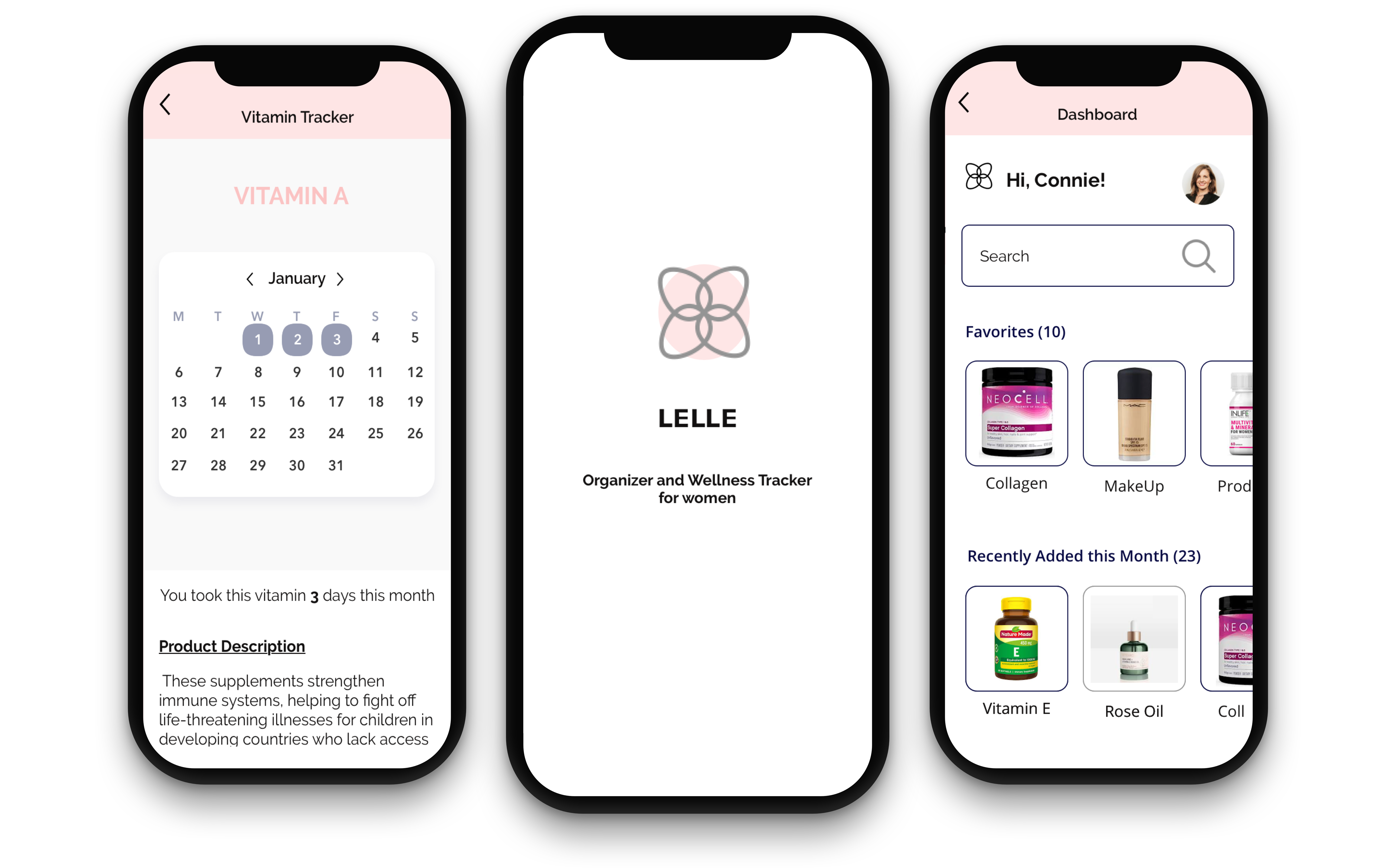
"Putting it all together. Featuring the final design of the Lelle Wellness and Tracking App."
Usability Testing
Usability tesing was conducted to test the usability and navigation, discover how users use the mobile app (forms, navigation bar), observe how long each participant takes to complete each task, and understand the users' experience using Lelle mobile app. With the feedback from the participants, I revamped my prototype and determine what revisions are needed to improve the user experience.
There was a total of 3 female participants aged 20-40. I completed evaluative research by performing in-person testing using Invision.
Usability Testing Results
- The navigation is clear and helpful for finding what the users need.
- Some participants wanted to see the vitamins and dosage when they first open the app.
- The wellness tracker was missing some elements that are helpful for women to track such as menstrual cycle, birth control, and sleep.
- Liked the idea of the reminders and thought it can be helpful for the vitamins and medications.
Affinity Map
From the test finding notes, I created the affinity map to analyze the results and to see what could be improved on the prototype. I grouped similar findings together which brought me valuable insights.
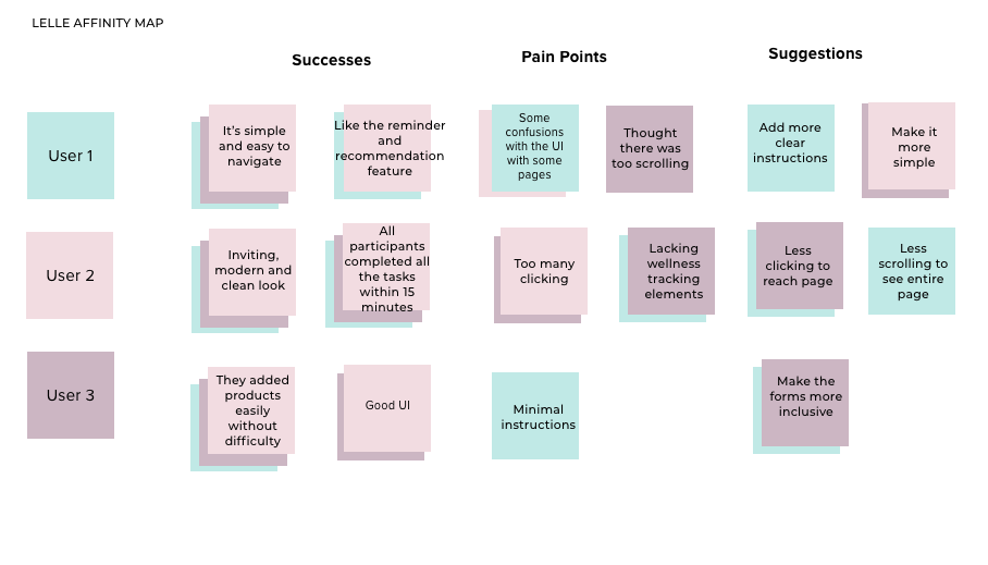
"I wish there were more clear instructions, but I think the app has a lot key features that monitors my overall health and set reminders for my daily needs."
Lessons Learned and Next Steps
This project was my first mobile app from start to finish. Designing a complex project like this app was challenging but it was fun for me as I was a nutrition enthusiast. I learned more about secondary research and in person interviews which helped me understand more about my target market and user needs when it comes to tracking nutrition products.
Next Steps: to perform a second usability testing with the revised prototype and refine the design process.
