Chase Case Study
New Feature Integration within the Chase App
Project Background
Chase, owned by JP Morgan, has one mission to empower customers’ lives by creating engaged, lifelong relationships. They spend many years on providing the most relevant products for their customers, but now they want to exceed their customer’s expectations and not just provide these products, but also provide them with personalized financial management tools within their mobile banking app. As a UI/UX designer, I helped in researching and designing features, including a budget planner and goal tracking feature based on the client's objectives.
Given this is a student project, the new features implemented are completely hypothetical, and I am not affiliated with Chase Bank.
Why We Should Care?
Chase realized that many millennials are now switching to mobile apps as a finance management tool. However, their app doesn't contain the standard features of personal financial management/ budgeting.
Our Solution
To provide current Chase customers with easy to use management tools including budgeting and goal saving features integrated into their existing app.
Market Research Demographics
- Twice the number of Millennials indicated increasing their use of mobile banking app.
- 73 percent of millennials are saving for life milestones and future goals.
- 75% are saving for retirement, while 51% are building an emergency fund.
With this information, Millennials need a personal finance management tool within their own banking app to help increase their growth, to start saving early for retirement and to manage their savings.

1. Research
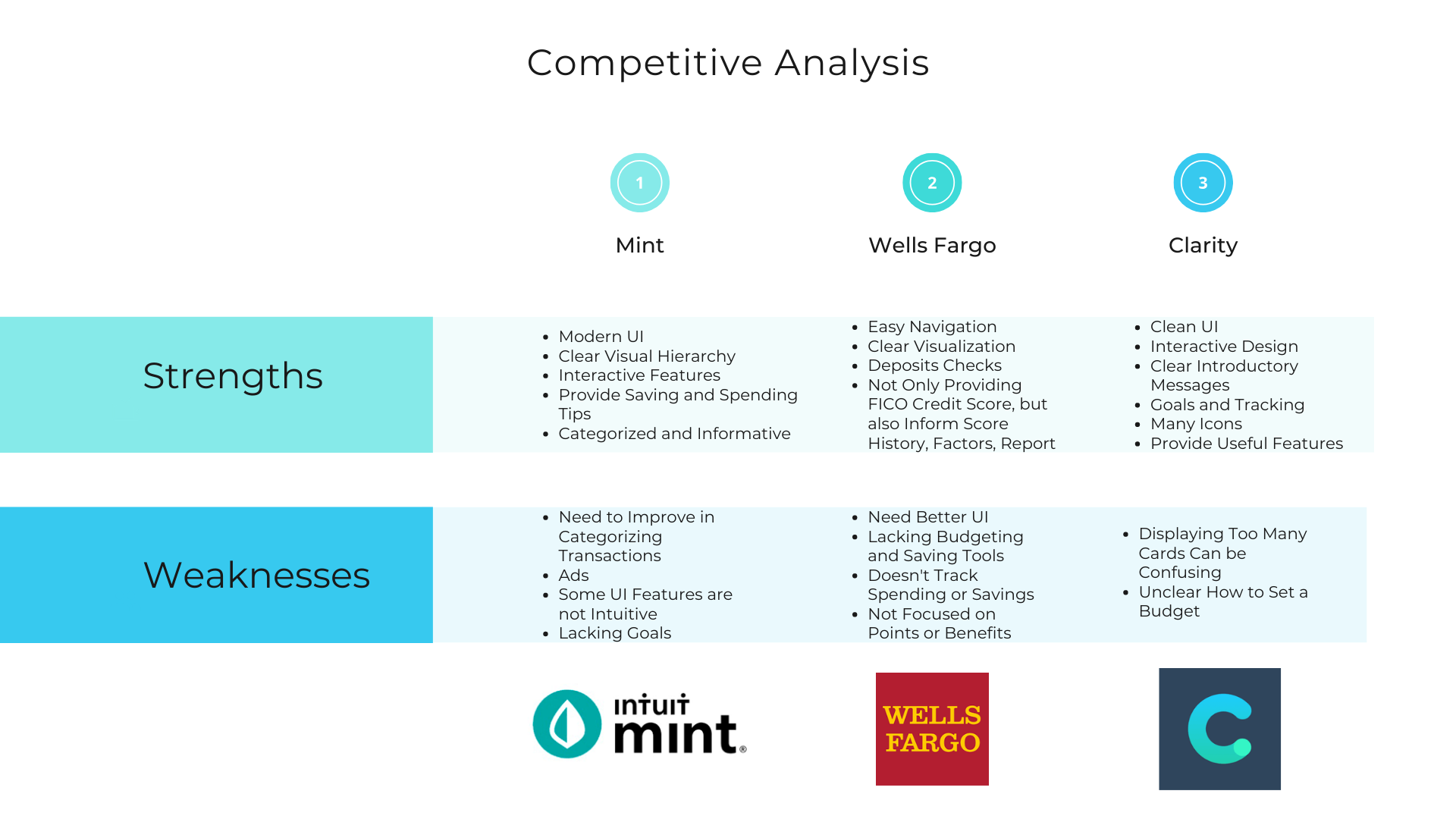
Competitive Analysis
With so many finance apps today, I knew Chase had many competitors. I found similar apps that provided an overview of features. Competitive analysis was essential to understanding strong design patterns and seeking opportunities for growth in the market. For example, I noticed how other companies' apps often prioritize transactions over budgeting tools. They have many useful UI features that brings clarity about their spending and savings; however, there is a barrier for users who lack clarity in terms of their budgeting and saving goals. With that said, it helped me with discovering ways for Chase to be a competitive online brand and shedding light as what the existing standard is. As a result, this help inform my design by developing new features that Chase's competitors are lacking.
User Interviews
As part of my research, I conducted user interviews to become familiar with trends in consumer behaviors related to finance, discover the main factors that influence consumers’ finances, and understand financial goals of our targeted users. For example, I wanted to understand more about users' spending patterns and if the users use any other finance management tools similar to ours.
For each participant, I asked open ended questions to better understand user needs and pain points and to collect qualitative information from participants. I interviewed 3 females and one male ages 20-40 in person, and all participants are currently using finance apps like Chase.
My first assumption was that users understand budgeting and how to manage their money using mobile apps. Conducting primary research and meeting with Chase customers made me realize that a number of users didn't use any budgeting and goal saving tools on their phone mainly due to the complexity of the mobile features and lack of interest. Thus, it is important to empathize with the users and to solve the users pain points and frustrations and design features that will be intuitive, interactive, and effortless.
4. UI Design
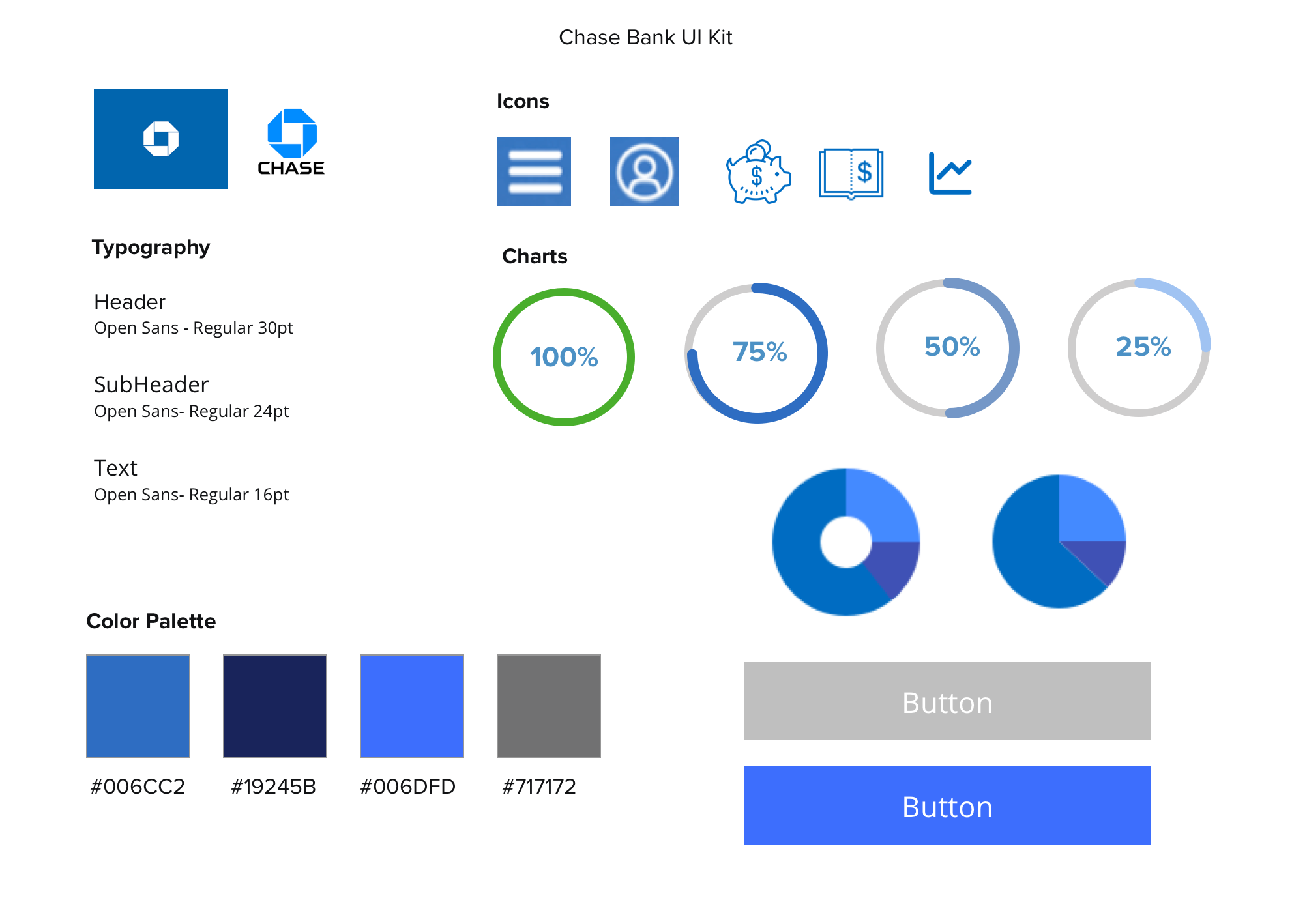
UI Kit
While designing the new features, I focused on Chase's existing styles and design patterns to create a familiar experience for users. As shown below, I created an UI kit that contains all the colors, elements, typography, and components, so I can follow the guidelines when designing the app and ensuring that the elements of the brand style are cohesive and aligned.
5. Iteration & Implementation
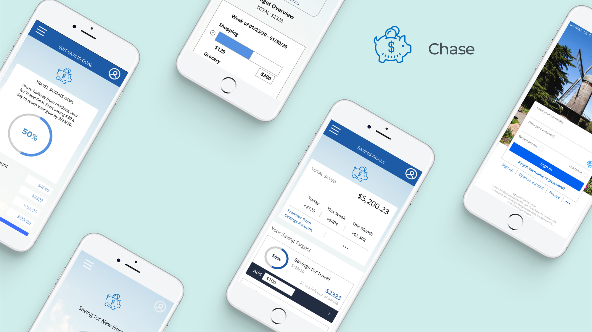
High-Fidelity Design
Next step was the high-fidelity wireframes where I created a clickable prototype using Invision and gathered user feedback based on the visual presentation and interaction design.
Based on the results from my 1:1 interviews, I thought it was interesting to see how users were able to recognize some design common patterns from the actual Chase mobile app. In addition, all my participants thought the app had a clean and user-friendly interface, and adapted to the new features. One participant even suggested using automation to transfer funds periodically from their savings account to add to their savings goals.
During the iteration process, I often try to put myself in the shoes of the participants.
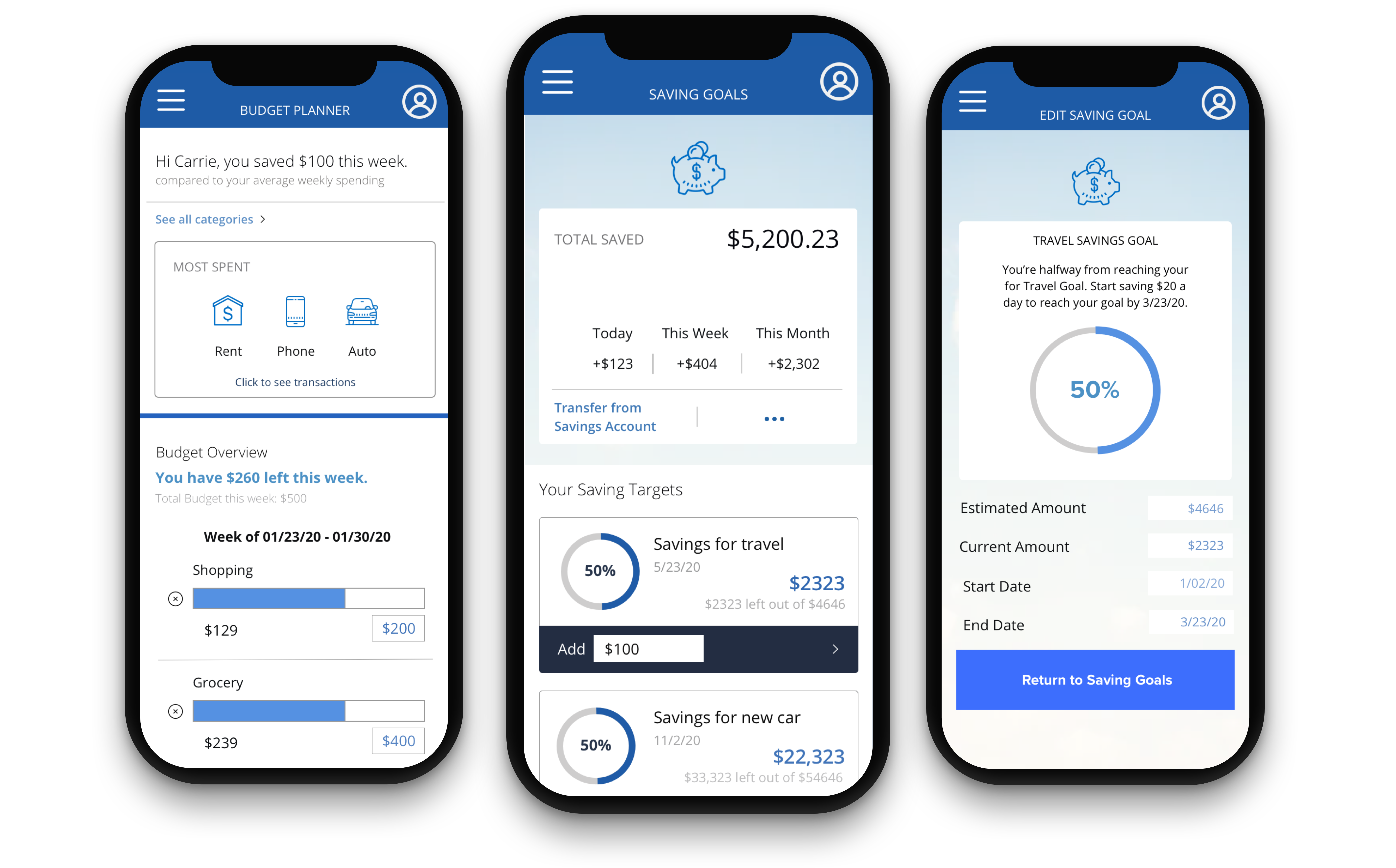
"Putting it all together. Featuring the final design of Chase's Saving Goal and Budget Tracking App."
Lessons Learned and Next Steps
Given this was my third UX/UI project, I have more knowledge of design tools and how to best conduct a usability testing.It took many iterations with testing until the users were able to navigate the app with ease. I also learned how to use my research to inform design decisions. The hardest part for me is thinking of new features. However, after chatting with my participants from the user interviews, I had a better idea of what my users need and also what their pain points are while using other finance apps.
Next Steps: to perform a second usability testing with the revised prototype and refine the design process.