BSM (Board Seat MeetUp) Case Study
A platform connecting board members to aspiring candidates for a seamless networking experience.
1. Research
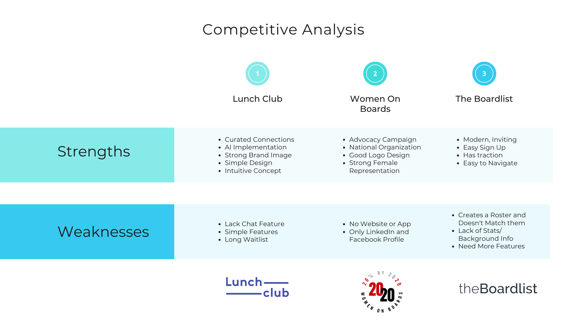
Competitive Analysis
To get a better feel of my competitors and the target audience, I first compared some of the most popular networking apps to understand their strengths and weaknesses, and to dive deeper into understanding some of their common features and patterns. From my research, I couldn't find many direct competitors that provide a curated networking platform where board members are able to connect with candidates via online meet ups or individual chats.
"A curated app with a strong network is essential for BSM."
User Interviews
After researching BSM's competitors, I started coming up with questions for the target user and wanted to see if they would be interested in using an app like BSM and to discover common challenges. I then conducted 1:1 user interviews with three participants who are considered ideal users of the app. The participants whom I interviewed were females and minority groups who were looking to become board members or current board member looking for new candidates.
The ultimate goal was to connect user needs to workable solutions and tools to assist them with their career.
- For each participant, I asked 8 open ended questions to uncover user wants, desires and existing frustrations.
- Key Takeaways: Connections are hard to find and it’s hard to schedule meetings with people who are constantly busy like board members. Also, the purpose of becoming board members is to build their profile, gain professional skills, and also make a difference in their community.
- As a result of the user interviews, I decided who my target audience is- lean females and minorities who are career focused.
User Persona
After the interviews, I felt like I had a better understanding of BSM's target demographic and created a persona by evaluating the feedbacks and observations from the participants responses. My goal is to help users like Samantha solve one of their largest challenges which is finding opportunities to connect with top leaders.
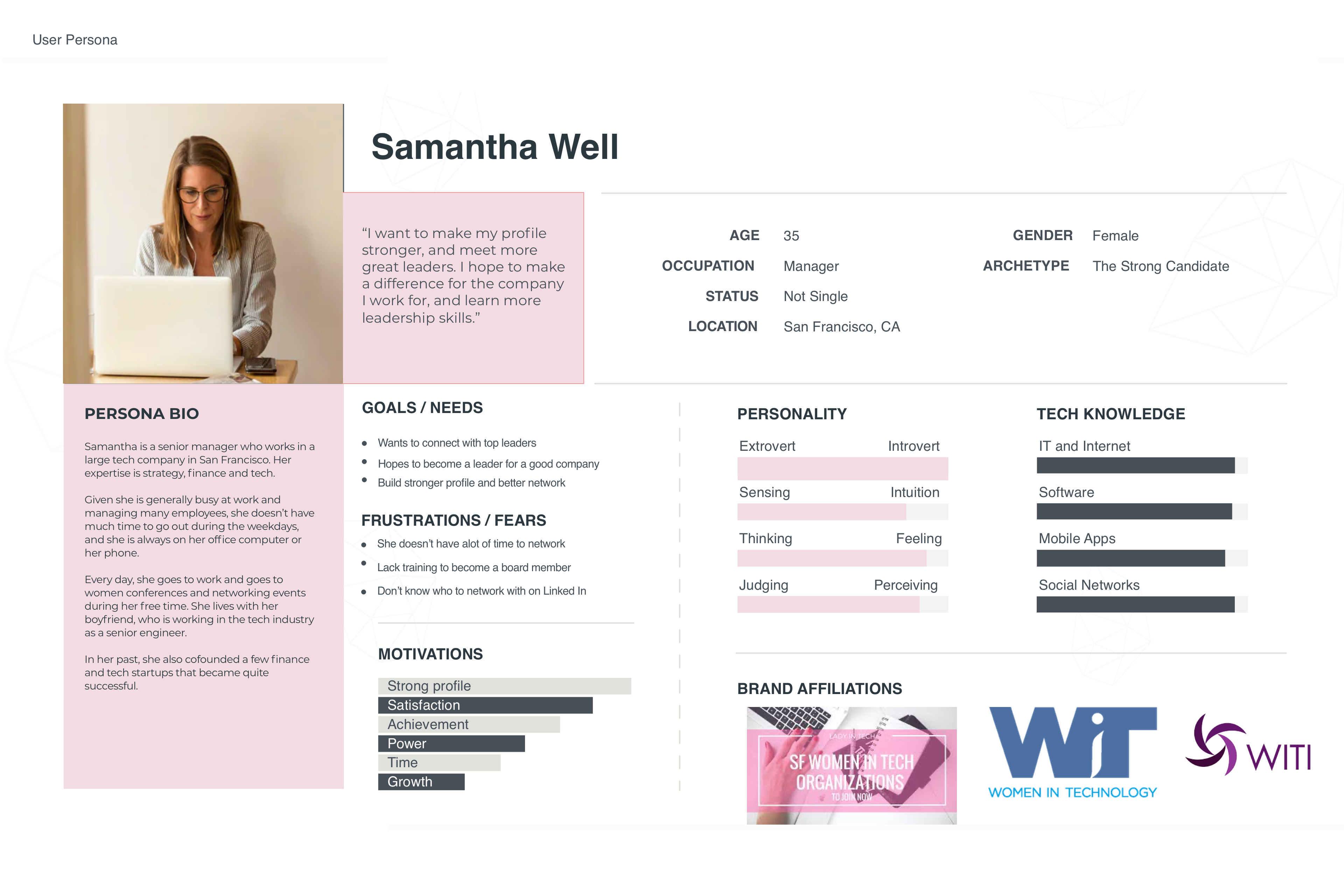
"Keeping up with my connections is hard as I am busy working everyday."
2. Information Architecture
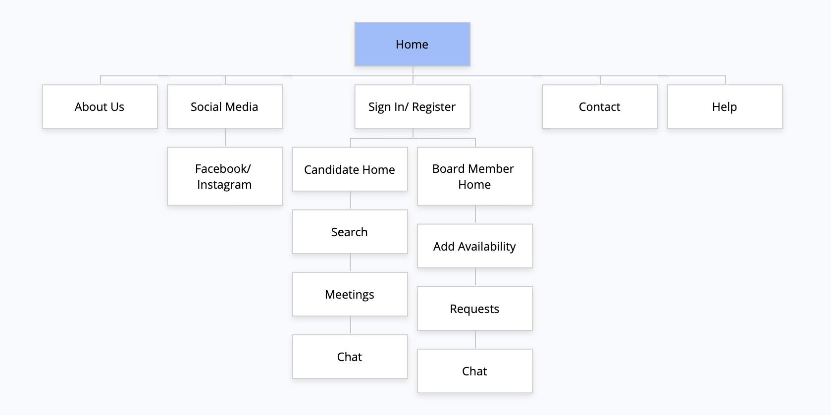
Site Map
Next, I began thinking about the content and created a sitemap that would be helpful to illustrate the information architecture by showing the features, the main screens, and the child screens. The sitemap helps us to also understand how screens are connected to each other. Planning early helps with the next steps of the design process. I often referred to the site map when building out my prototypes and ensuring the flow of each page was inline with the research.
"Defining the structure"
3. Interaction Design
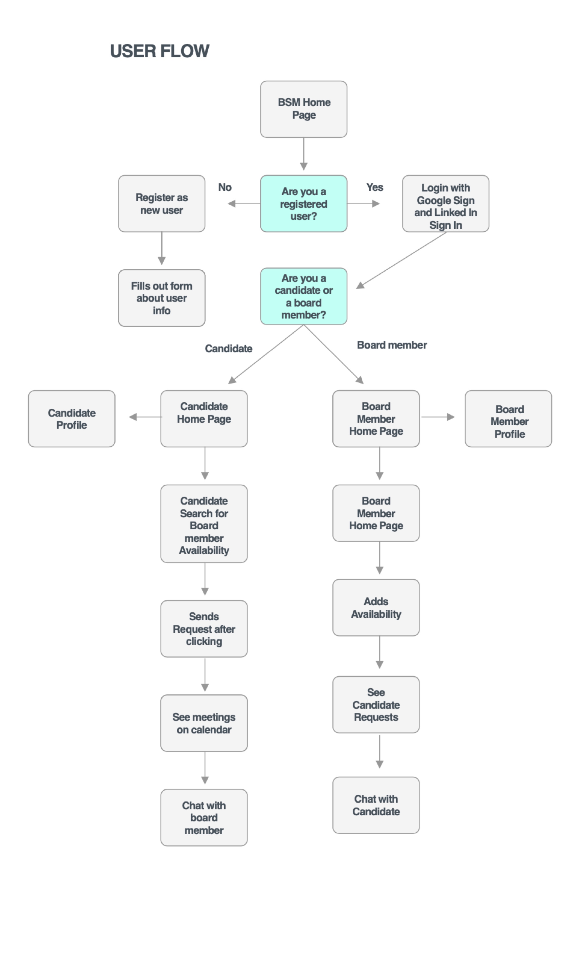
User Flows
With a general idea about the requirements and features needed, I created a user flow to illustrate different pathways that a user can take to navigate, because I wanted to ensure the interaction design would be intuitive to the user. With the user journey in mind, I started envisioning each screen's content following this structure. I had to put myself in the shoes of a board member or a candidate and often refer back to the target users' ultimate goals and motivations. Also, I wanted to solve some of the users' pain points of setting up meetings and ensuring the user feels secure while using the app.
"This is the beginning of creating the wireframes for the BSM Mobile app."
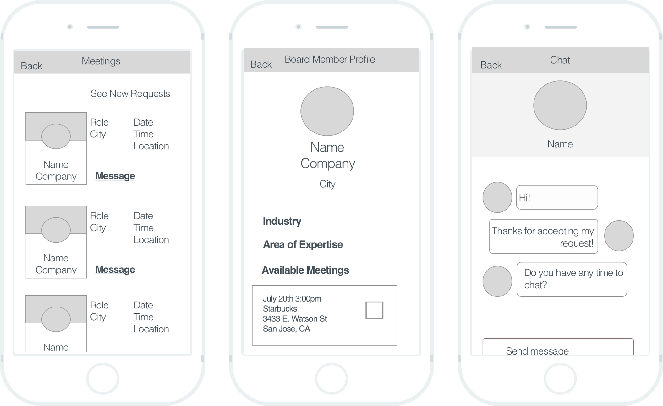
Low-Fidelity Prototype
After completing the site map and task/ user flows, I began wireframing the sketches that I brainstormed. This was a great way to test for functionality with given tasks. After producing several different versions, I completed 19 wireframe pages including login, search, chat, profile, add availability and meetings. Then, I connected the pages using InVision to create an interactive prototype.
With a functional low-fidelity prototype, the users could provide feedback on the site's navigation and interaction design rather than focusing on the visual design.
Usability Testing
I conducted usability testing to test the usability and navigation, discover how users use the mobile app (forms, search, navigation bar), observe how long each participant takes to complete each task, and understand the users' experience using BSM mobile app. The goal is to have users connect 1:1 with either board members or candidates. Some tasks include searching, sending requests and chatting. With the feedback from the participants, I revamped my prototype and determine what revisions are needed to improve the user experience.
With this testing, it helped me to uncover problems such as uncertainly with the forms, discover opportunities or frustrations, see if we met the user's expectations, and learn about the users. Also, I learned how to ask better questions and focus on user actions as well as their comments.
4. UI Design
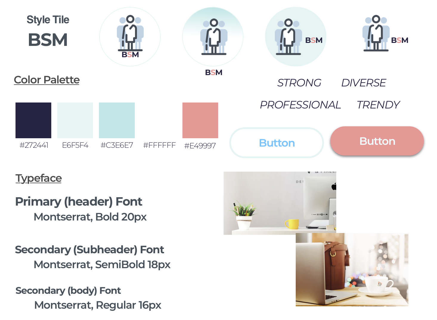
UI Kit
In this step, I determined the vibe of the app and created an UI kit that reflected BSM's brand and chose a welcoming color palette that aims for a modern, fresh, and positive feel for BSM. Documenting the colors, typography, and components of the app made it easy when it came to the visual design process.
5. Iteration & Implementation
High-Fidelity Design
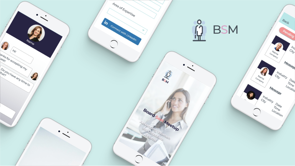
From the low-fidelity wireframes and the comments from the first usability testing, I explored different variations to provide a better flow for the user and incorporated the strongest elements from my mockups. I then conducted a second round of usability testing, so users can provide more open feedback on the overall design and what works or doesn't work for them. As a result, I streamlined the sign-in process with less form fields and a faster login process, focused more on consistency and modularity, and ensured the navigation is working throughout the app. Below is the snapshot I created of the high-fidelity prototype following common design patterns and a balance of white space and content.
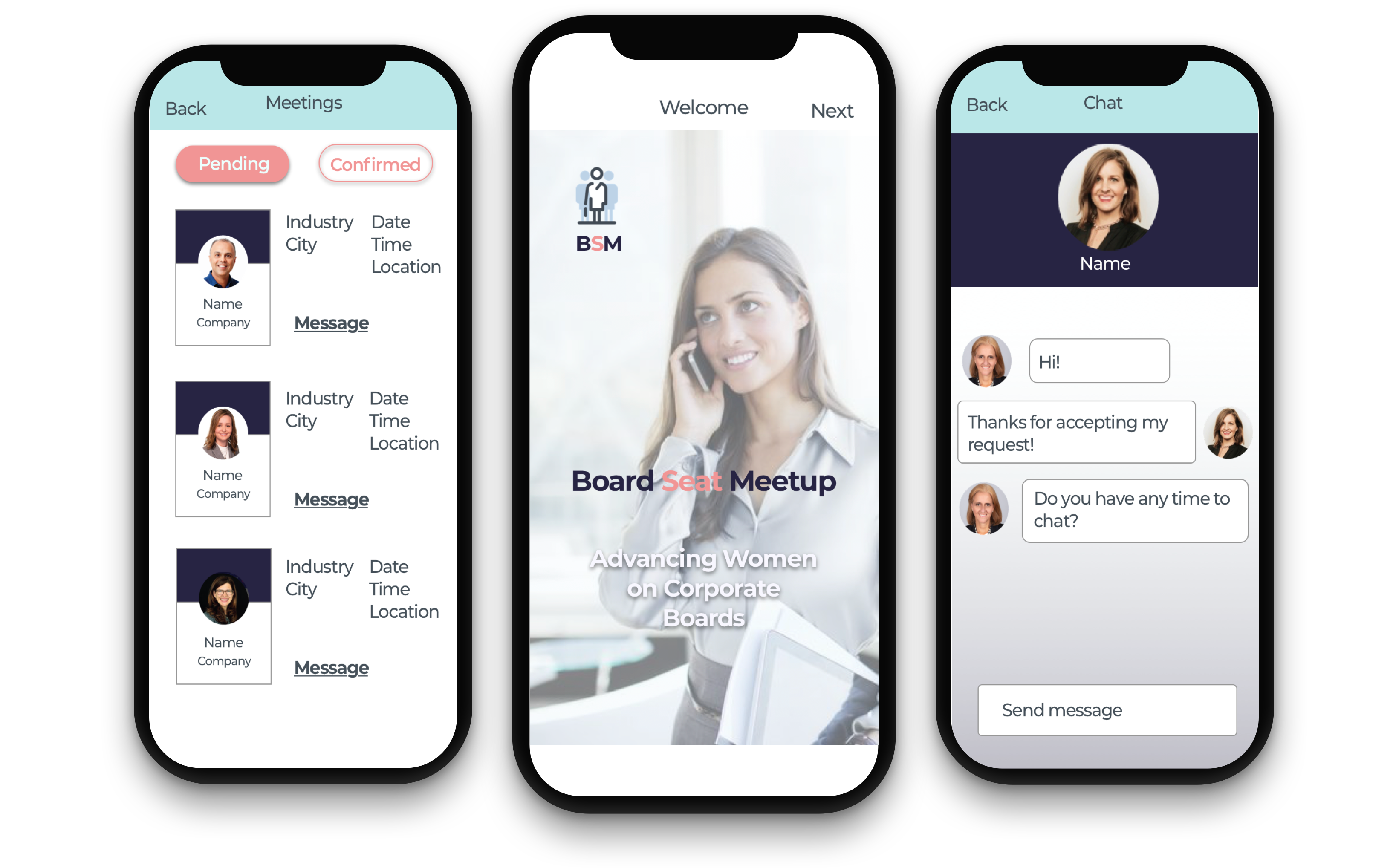
"Putting it all together. Featuring the final design of the BSM Networking App."
Lessons Learned and Next Steps
Given this was my second UX/UI project, I am still learning to use the design tools and to perform research with participants. I learned what makes good usability in terms of mobile applications and also how to best interview your participants.
Next Steps: to perform a second usability testing with the revised prototype and refine the design process. If I had more time, I would add a calendar feature and also improve on the chat component.